Blazor
Blazor apps are based on components. A component in Blazor is an element of UI, such as a page, dialog, or data entry form.
Components are .NET C# classes built into .NET assemblies that:
- Define flexible UI rendering logic.
- Handle user events.
- Can be nested and reused.
- Can be shared and distributed as Razor class libraries or NuGet packages.
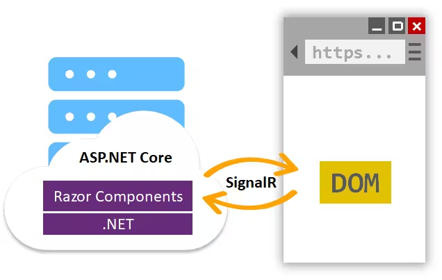
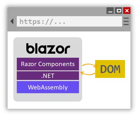
The component class is usually written in the form of a Razor markup page with a .razor file extension. Components in Blazor are formally referred to as Razor components.
Components (.razor)
Blazor Components
| C# |
|---|
| @page "/route/{RouteParameter}" // make component accessible from a URL
@page "/route/{RouteParameter?}" // specify route parameter as optional
@page "/route/{RouteParameter:<type>}" // specify route parameter type
@namespace <Namespace> // set the component namespace
@using <Namespace> // using statement
@inherits BaseType // inheritance
@attribute [Attribute] // apply an attribute
@inject Type objectName // dependency injection
// html of the page here
<Namespace.ComponentFolder.Component /> // access component w/o @using
<Component Property="value"/> // insert component into page, passing attributes
<Component @onclick="@CallbackMethod">
@ChildContent // segment of UI content
</Component>
@code {
// component model (Properties, Methods, ...)
[Parameter] // capture attribute
public Type Property { get; set; } = defaultValue;
[Parameter] // capture route parameters
public type RouteParameter { get; set;}
[Parameter] // segment of UI content
public RenderFragment ChildContent { get; set;}
private void CallbackMethod() { }
}
|
State Management
Passing state with NavigationManager
It's now possible to pass state when navigating in Blazor apps using the NavigationManager.
| C# |
|---|
| navigationManager.NavigateTo("/<route>", new NavigationOptions { HistoryEntryState = value });
|
This mechanism allows for simple communication between different pages. The specified state is pushed onto the browser’s history stack so that it can be accessed later using either the NavigationManager.HistoryEntryState property or the LocationChangedEventArgs.HistoryEntryState property when listening for location changed events.
Blazor WASM
| C# |
|---|
| // setup state singleton
builder.Services.AddSingleton<StateContainer>();
|
| C# |
|---|
| // StateContainer singleton
using System;
public class StateContainer
{
private int _counter;
public string Property
{
get => _counter;
set
{
_counter = value;
NotifyStateChanged(); // will trigger StateHasChanged(), causing a render
}
}
public event Action OnChange;
private void NotifyStateChanged() => OnChange?.Invoke();
}
|
| C# |
|---|
| // component that changes the state
@inject StateContainer State
// Delegate event handlers automatically trigger a UI render
<button @onClick="@HandleClick">
Change State
</button>
@code {
private void HandleClick()
{
State.Property += 1; // update state
}
}
|
| C# |
|---|
| // component that should be update on state change
@implements IDisposable
@inject StateContainer State
<p>Property: <b>@State.Property</b></p>
@code {
// StateHasChanged notifies the component that its state has changed.
// When applicable, calling StateHasChanged causes the component to be rerendered.
protected override void OnInitialized()
{
State.OnChange += StateHasChanged;
}
public void Dispose()
{
State.OnChange -= StateHasChanged;
}
}
|
Data Binding & Events
| C# |
|---|
| <p>
<button @on{DOM EVENT}="{DELEGATE}" />
<button @on{DOM EVENT}="{DELEGATE}" @on{DOM EVENT}:preventDefault /> // prevent default action
<button @on{DOM EVENT}="{DELEGATE}" @on{DOM EVENT}:preventDefault="{CONDITION}" /> // prevent default action if CONDITION is true
<button @on{DOM EVENT}="{DELEGATE}" @on{DOM EVENT}:stopPropagation />
<button @on{DOM EVENT}="{DELEGATE}" @on{DOM EVENT}:stopPropagation="{CONDITION}" /> // stop event propagation if CONDITION is true
<button @on{DOM EVENT}="@(e => Property = value)" /> // change internal state w/ lambda
<button @on{DOM EVENT}="@(e => DelegateAsync(e, value))" /> // invoke delegate w/ lambda
<input @ref="elementReference" />
<input @bind="{PROPERTY}" /> // updates variable on ONCHANGE event (focus loss)
<input @bind="{PROPERTY}" @bind:event="{DOM EVENT}" /> // updates value on DOM EVENT
<input @bind="{PROPERTY}" @bind:format="{FORMAT STRING}" /> // use FORMAT STRING to display value
<ChildComponent @bind-{PROPERTY}="{PROPERTY}" @bind-{PROPERTY}:event="{EVENT}" /> // bind to child component {PROPERTY}
<ChildComponent @bind-{PROPERTY}="{PROPERTY}" @bind-{PROPERTY}:event="{PROPERTY}Changed" /> // bind to child component {PROPERTY}, listen for custom event
<input @bind="{PROPERTY}" @bind:after="{DELEGATE}" /> // run async logic after bind event completion
<input @bind:get="{PROPERTY}" @bind:set="PropertyChanged" /> // two-way data binding
</p>
@code {
private ElementReference elementReference;
public string Property { get; set; }
public EventCallback<Type> PropertyChanged { get; set; } // custom event {PROPERTY}Changed
// invoke custom event
public async Task DelegateAsync(EventArgs e, Type argument)
{
/* ... */
await PropertyChanged.InvokeAsync(e, argument); // notify parent bound prop has changed
await elementReference.FocusAsync(); // focus an element in code
}
[Parameter] public TValue Value { get; set; }
[Parameter] public EventCallback<TValue> ValueChanged { get; set; }
}
|
Note: When a user provides an unparsable value to a data-bound element, the unparsable value is automatically reverted to its previous value when the bind event is triggered.
Note: The @bind:get and @bind:set modifiers are always used together.
The @bind:get modifier specifies the value to bind to and the @bind:set modifier specifies a callback that is called when the value changes
Javascript/.NET Interop
Call Javascript from .NET
Call .NET from Javascript
Render Blazor components from JavaScript
To render a Blazor component from JavaScript, first register it as a root component for JavaScript rendering and assign it an identifier:
| C# |
|---|
| // Blazor Server
builder.Services.AddServerSideBlazor(options =>
{
options.RootComponents.RegisterForJavaScript<Counter>(identifier: "counter");
});
// Blazor WebAssembly
builder.RootComponents.RegisterForJavaScript<Counter>(identifier: "counter");
|
Load Blazor into the JavaScript app (blazor.server.js or blazor.webassembly.js) and then render the component from JavaScript into a container element using the registered identifier, passing component parameters as needed:
| JavaScript |
|---|
| let containerElement = document.getElementById('my-counter');
await Blazor.rootComponents.add(containerElement, 'counter', { incrementAmount: 10 });
|
Blazor custom elements
Experimental support is also now available for building custom elements with Blazor using the Microsoft.AspNetCore.Components.CustomElements NuGet package.
Custom elements use standard HTML interfaces to implement custom HTML elements.
To create a custom element using Blazor, register a Blazor root component as custom elements like this:
| C# |
|---|
| options.RootComponents.RegisterAsCustomElement<Counter>("my-counter");
|