CSS
Applying CSS to HTML
Inline CSS
The style only applies to one element at a time.
| HTML | |
|---|---|
Embedded CSS
The style is not shared but only applies to one HTML file.
External CSS
- Shared resource, can be referenced from multiple pages.
- Can be cached, reduced HTML file size & bandwidth.
| HTML | |
|---|---|
CSS Selectors
A CSS selector points to an html element to style.
Multiple Selectors
| CSS | |
|---|---|
Nested Selectors
Used to select tags nested in other tags.
| CSS | |
|---|---|
ID Selector
Can only apply to one element in a page.
| CSS | |
|---|---|
Class Selector
Many elements can have the same class, classes are used to group HTML elements together.
| CSS | |
|---|---|
Universal Selector
| CSS | |
|---|---|
Descendant selector (space)
Selects an element that resides anywhere within an identified ancestor element.
| CSS | |
|---|---|
| HTML | |
|---|---|
Direct child selector (>)
Selects an elements that resides immediately inside an identified parent element.
| CSS | |
|---|---|
| HTML | |
|---|---|
General sibling selector (~)
Selects an element that follows anywhere after the prior element.
Both elements share the same parent.
| CSS | |
|---|---|
Adjacent sibling selector (+)
Selects an element that follows directly after the prior element.
Both elements share the same parent.
| CSS | |
|---|---|
Namespace Separator (|)
The namespace separator separates the selector from the namespace, identifying the namespace, or lack thereof, for a type selector.
| CSS | |
|---|---|
| CSS | |
|---|---|
| HTML | |
|---|---|
Column Selector (||)
The column combinator (||) is placed between two CSS selectors. It matches only those elements matched by the second selector that belong to the column elements matched by the first.
| CSS | |
|---|---|
Attribute Present Selector (tag[attr])
a[target]{ property: value; } will match
| HTML | |
|---|---|
Attribute Equals Selector (=)
a[href="https://google.com"] { property: value; } will match
| HTML | |
|---|---|
Attribute Contains Selector (*=)
a[href*="login"] { property: value; } will match
| HTML | |
|---|---|
Attribute Begins With Selector (^=)
a[href^="Https://"] { property: value; } will match
| HTML | |
|---|---|
Attribute Ends With Selector ($=)
a[href$=".pdf"] { property: value; }
| HTML | |
|---|---|
Attribute Spaced Selector (~=)
img[alt~="child"] { property: value; }
| HTML | |
|---|---|
Attribute Hyphenated Selector (|=)
p[lang|="en"] { property: value; }
| HTML | |
|---|---|
Pseudo-Classes
Pseudo-classes can style elements based on their current state. They must be specified after the base case.
| CSS | |
|---|---|
Link Pseudo-Classes
a:link {...} selects only <a> tags that have href attribute, same as a[href].
a:visited {...} selects links that have already been visited by the current browser.
User Action Pseudo-Classes
a:hover {...} selects a link when the mouse rolls over it (hover state).
a:active {...} selects the link while it's being activated (clicked or otherwise).
selector:focus {...} selects an element when the user focuses on it (e.g. tab w/ keyboard). Often used on links, inputs, text-areas.
User Interface State Pseudo-Classes
input:enabled {...} selects an input that is in the default state of enabled and available for use.
input:disabled {...} selects an input that has the attribute.
input:checked {...} selects checkboxes or radio buttons that are checked.
input:indeterminate {...} selects checkboxes or radio button that has neither selected nor unselected.
Structural & Position Pseudo-Classes
selector:first-child {...} selects an element if it's the first child within its parent.
selector:last-child {...} selects an element if it's the last element within its parent.
selector:only-child {...} will select an element if it is the only element within a parent.
selector:first-of-type {...} selects the first element of its type within a parent.
selector:last-of-type {...} selects the last element of its type within a parent.
selector:only-of-type {...} selects an element if it is the only of its type within a parent.
selector:nth-child() {...} selects elements based on a simple provided algebraic expression (e.g. "2n" or "4n-1").
Can select even/odd elements, "every third", "the first five", etc.
selector:nth-of-type() {...} works like :nth-child in places where the elements at the same level are of different types.
selector:nth-last-of-type() {...} like :nth-of-type but counts up from the bottom instead of the top.
selector:nth-last-child() {...} like :nth-child but counts up from the bottom instead of the top.
Empty & Negation Pseudo-Classes
selector:empty {...} selects elements with no content (empty tags).
selector:not() {...} selects elements that do not have a certain tag, attribute, class, ID, etc.
Pseudo-Elements
Dynamic elements that don't exist in the document tree. When used within selectors allow unique parts of the page to be stylized. Only one pseudo-element may be used within a selector at a given time.
Textual Pseudo-Elements
selector::first-letter {...} selects the first letter of the text within an element.
selector::first-line {...} selects the first line of text within an element.
Content Pseudo-Elements
selector::before {...} creates a pseudo-element before, or in front of, the selected element.
selector::after {...} creates a pseudo-element after, or behind, the selected element.
These pseudo-elements appear nested within the selected element, not outside of it.
| CSS | |
|---|---|
Fragment Pseudo-Elements
selector::selection {...} identifies part of the document that has been selected, or highlighted, by a user's actions.
CSS Cascading
The browser assigns different priorities to CSS depending on the type of selector.
- Inline CSS (Most Important)
- ID selector
- Class selector
- Element selector (Least Important)
The browser also assigns priority based on the specificity of the selection. More specific selectors have higher priority.
Rules lower in the file overwrite higher rules in the file.
Cascading Override With !important
The !important declaration overrides any other declaration.
Using it is very bad practice because it makes debugging more difficult by breaking the natural cascading in stylesheets.
Only use !important when:
- overriding foreign CSS (e.g. from a library)
- overriding inline CSS
Specificity
A weight is applied to a CSS declaration, determined by the number of each selector type:
1-0-0: ID selector0-1-0: Class selector, Attribute selector, Pseudo-class0-0-1: Element Selector, Pseudo-element0-0-0: Universal selector (*), combinators (+,>,~,||) and negation pseudo-class:not()
Note: The selectors declared inside
:not()contribute to the weight.
Units
Absolute Length units
| Unit | Name | Equivalent to |
|---|---|---|
cm |
centimeters | 1cm = 38px = 25/64in |
mm |
Millimeters | 1mm = 1/10th of 1cm |
Q |
Quarter-millimeters | 1Q = 1/40th of 1cm |
in |
Inches | 1in = 2.54cm = 96px |
pc |
Picas | 1pc = ⅙th of 1in |
pt |
Points | 1pt = 1/72th of 1in |
px |
Pixels | 1px = 1/96th of 1in |
Relative Length Units
| Unit | Relative to |
|---|---|
rem |
Font size of the root element. |
em |
Font size of the parent or the element itself |
ex |
x-height of the element's font. |
ch |
The advance measure (width) of the glyph "0" of the element's font. |
lh |
Line height of the element. |
vw |
1% of the viewport's width. |
vh |
1% of the viewport's height. |
vmin |
1% of the viewport's smaller dimension. |
vmax |
1% of the viewport's larger dimension. |
% |
Relative to the parent element |
Common Element Properties
Color
Background
Font
Text Decoration & Aliment
text-decoration values:
text-decoration-line: Sets the kind of decoration used, such as underline or line-through.text-decoration-color: Sets the color of the decoration.text-decoration-style: Sets the style of the line used for the decoration, such as solid, wavy, or dashed.text-decoration-thickness: Sets the thickness of the line used for the decoration.
text-align values:
start: The same as left if direction is left-to-right and right if direction is right-to-left.end: The same as right if direction is left-to-right and left if direction is right-to-left.left: The inline contents are aligned to the left edge of the line box.right: The inline contents are aligned to the right edge of the line box.center: The inline contents are centered within the line box.justify: The inline contents are justified. Text should be spaced to line up its left and right edges to the left and right edges of the line box, except for the last line.justify-all: Same as justify, but also forces the last line to be justified.match-parent: Similar to inherit, but the values start and end are calculated according to the parent's direction and are replaced by the appropriate left or right value.
Size
| CSS | |
|---|---|
Note:
widthandheightproperties do not have effect on inline elements.
Hiding Elements
There are several methods to 'hide' elements:
display: noneremoves the element from the document flowvisibility: hiddenhides the element, but it still takes up space in the layoutopacity: 0hides the element, still takes up space in the layout, events work
| Rule | Collapse | Events | Tab Order |
|---|---|---|---|
display: none |
Yes | No | No |
visibility: hidden |
No | No | No |
opacity: 0 |
No | Yes | Yes |
Box Model
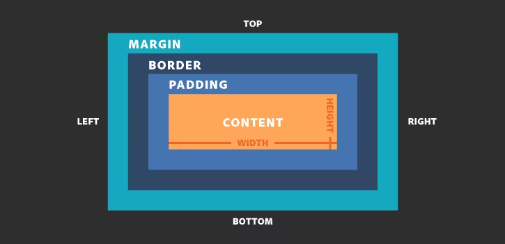
Padding
Space between the border and the content.
It's possible to specify the padding for each side of the element:
Note: Padding adds to the total size of the box, unless
box-sizing: border-box;is used.
Border
Borders are specified as "size, style, color".
Note: Border adds to the total size of the box,
unless box-sizing: border-box;is used
Box Sizing
Defines whether the width and height (and min/max) of an element should include padding and borders or not.
| CSS | |
|---|---|
Margin
Transparent area around the box that separates it from other elements.
It's possible to specify the margin for each side of the element.
Note: Top and bottom margins of near elements are collapsed into a single margin that is equal to the largest of the two margins.
Element Positioning
Static Positioning
All HTML elements are positioned static by default.
Static elements are positioned in the normal flow of the page.
Static elements ignore top, bottom, right, or left property specifications.
In normal flow block elements flow from top to bottom making a new line after every element. In normal flow inline elements flow from left to right wrapping to next line when needed.
Relative positioning
Takes the element out of the normal flow, allowing it to be moved in relation to the top, bottom, right, or left but does not affect the elements surrounding it.
Makes an element a "positioning context" in which to position other elements relative to it.
The relative value will still put the element in the normal flow, but then offset it according to top, bottom, right and left properties.
Absolute Positioning
Positions element outside of the normal flow and other elements act as if it's not there.
An absolutely positioned element is offset from its container block, set with the properties top, bottom, right and left.
Its container block is the first surrounding element that has any position other than static.
If no such element is found, the container block is <html>.
Fixed Positioning
The fixed value takes an element out of the normal flow, it positions it relative to the viewport.
Parent positioning will no longer affect fixed elements.
Sticky Positioning
Sticky positioning is a hybrid of relative and fixed positioning.
The element is treated as relative positioned until it crosses a specified threshold, at which point it is treated as fixed positioned.
Note: sticky is not supported by IE and still needs to be prefixed for webkit based browsers
Z-Index
When elements overlap, the order of overlapping can be changed with z-index:
- The element with highest z-index goes on top
- Without z-index, elements stack in the order that they appear in the DOM
- Elements with non-static positioning will always appear on top of elements with default static positioning
Nesting is important: if element B is on top of element A, a child of element A can never be higher than element B.
Layouts
Inline
- The default value for elements (e.g.
<span>,<em>,<b>, etc.) - Doesn't break the flow of the text
- The element will accept margin and padding, but the element still sits inline
- Margin and padding will only push other elements horizontally, not vertically
- An inline element will not accept height and width.
Block
- Some elements are set to block by the browser UA (user agent) stylesheet
- Container elements, like
<div>,<section>,<ul>, etc. - Text block elements like
<p>,<h1>,<h2>, etc. - Do not sit inline
- By default take up as much horizontal space as they can
Inline Block
- Combines aspects of inline and block
- Very similar to inline in that it will sit inline with the natural flow of text
- Able to set a width and height
None
display: noneremoves the element from the document flow- The element does not take up any space
Flex
Grid
| CSS | |
|---|---|
Variables
| CSS | |
|---|---|
Responsive Design
A responsive website or application automatically adjusts to the screen and adapts to any device.
Viewport Meta-Tag
Is located in the <head> of the HTML document. It defines how a site should render in a web browser for mobile devices and makes media queries will work as intended.
| HTML | |
|---|---|
device-width: indicates the width should match with the viewport of the deviceinitial-scale: ensure the zoom will not be applied and the layout will always show on a1:1scale
Media Queries
Media queries allow the customization of web pages for specific devices screen sizes. A media query is a logical expression: true or false; if a media query is true, the related rules are applied to the target device.
Types:
all: all media type devices.print: printers.screen: computer screens, tablets, smart-phones, etc.speech: screen readers that "reads" the page out loud.
Features:
widthmin-widthmax-widthheightmin-heightmax-heightorientation
It's possible to specify a media attribute in the link element. This applies a whole stylesheet when the condition is true:
| HTML | |
|---|---|
It's also possible to have different stylesheets based on media type: